
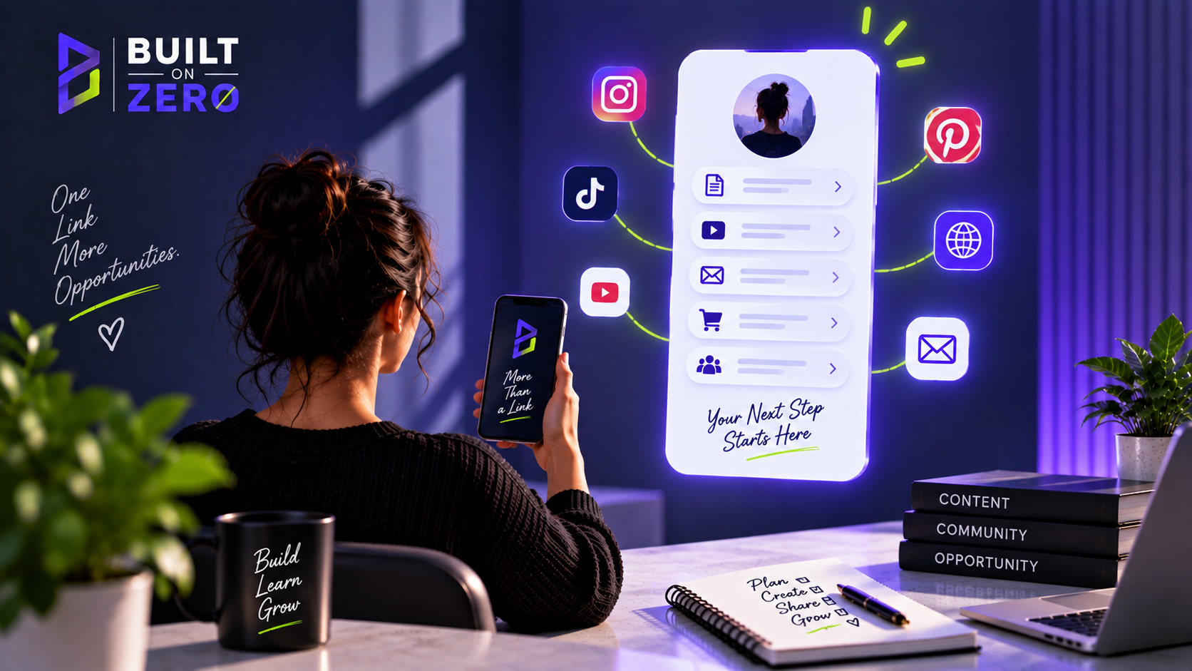
When I first created the Built on Zero link-in-bio page, I thought of it as a practical necessity. Instagram gives you limited space, TikTok gives you limited space, and I needed one link that could point people toward the rest of the project. The danger is that link-in-bio pages often become little junk drawers. Every platform, every offer, every article and every social profile gets a button until the visitor is presented with a menu rather than a decision.
I wanted to avoid that. If someone leaves a social platform to tap my bio link, they have already done more than most viewers. That click is valuable. I do not want the first thing they see to be twelve equal options asking them to decide which part of my business matters. I want the page to help them continue from the interest that brought them there.
Systeme.io can be used to build this kind of page without a separate link-in-bio subscription. It is not a dedicated creator-hub product like Beacons, and I covered that distinction in my comparison article, but a simple page in Systeme.io can contain the links, branding and calls to action I need. More importantly, those buttons can lead directly into the funnels and content already living in the same ecosystem.
The first button should probably be the most valuable next step, not “Instagram” when the person has literally just come from Instagram. For Built on Zero, that is likely the $0 Business Stack. It gives the visitor a reason to become a subscriber instead of bouncing from one social profile to another. After that, I can feature the most useful current guide, the main Systeme.io resource or another piece of content with a clear purpose.
I also want the page to explain Built on Zero in one short piece of copy. The social bio has already done some of that work, but the landing page can reinforce it: I am building an online income experiment from $0 and documenting the tools, mistakes and results. That tells the visitor what connects the links. Without that sentence, a list of buttons can feel random.
Design should be recognisable but restrained. The Built on Zero violet and lime can appear in the page, but I do not need every button to glow. The goal is readability on a phone. Large enough text, enough spacing to tap comfortably and strong contrast matter more than clever effects. Most people will see this page on a small screen, probably while distracted, so I am designing for thumbs rather than a desktop portfolio review.
BUILD A FREE LINK-IN-BIO PAGE WITH SYSTEME.IO — CLICK HERE
That is my affiliate link. If you later purchase an eligible Systeme.io plan, I may earn a commission. You can create the basic page on the free plan, which currently includes funnels, a website/blog capability and one custom domain.
The page also gives me an opportunity to test priorities. If the $0 Business Stack button gets most clicks, that tells me something. If a particular tutorial consistently attracts attention, that tells me something else. A link-in-bio page can become a small research instrument instead of a static directory. I can change the order based on what is current and what the audience actually uses.
I would not change it every day, though. Constant optimisation can become another form of fiddling. Give the page enough traffic to learn something. The biggest improvement at the beginning is usually not button colour; it is having a stronger reason to click. “Free tools I use to build from $0” is more interesting than “Resources.” Specificity does the heavy lifting.
One useful strategy is to rotate one featured item while keeping the core links stable. The lead magnet can remain first. A “Start here” guide can remain second. The third position can feature the newest useful article, challenge update or tutorial. That gives regular followers a reason to return without making the whole page unfamiliar every week.
I also want to keep affiliate disclosure clear when a button is commercial. If a link goes directly to Systeme.io through my affiliate URL, I can label the relationship nearby or route the visitor through a page where the disclosure and recommendation have proper context. I prefer the second approach for cold visitors because a naked affiliate button tells them almost nothing about why they should click.
This is where blog content becomes useful. Instead of a button saying “Systeme.io,” I can send the visitor to my honest review or free-plan guide. That article can explain who the platform suits, what annoyed me, what the free plan includes and why I am using it. The affiliate link appears after the reader has enough information to make a decision. The extra click can actually improve the quality of the click.
The link-in-bio page should also support Pinterest even though Pinterest links can often go directly to articles. Someone who discovers the Built on Zero profile may want a central place to explore. The same is true once YouTube is ready. I do not need a separate destination for every platform. One branded hub can remain stable while the traffic sources multiply.
I would avoid putting email signup fields directly everywhere unless the page gives a clear reason to subscribe. “Join my newsletter” is not a compelling value proposition for a stranger. “Get the $0 Business Stack” gives the email exchange a purpose. People are not looking for more newsletters; they are looking for outcomes, answers and resources.
Another advantage of building the page inside the broader system is that I can change what happens after the click without changing the bio URL. The public link remains stable while the internal destination evolves. That is useful because social bios, old videos and pins can continue pointing to the same place even as Built on Zero grows.
There are dedicated link-in-bio platforms with stronger creator-specific features, and if you need a media kit, sophisticated storefront or particular social tools, use them. I am not trying to make Systeme.io win a category it was not primarily designed for. My question is whether I need another subscription or platform for a simple job I can already accomplish inside the system I am using. Right now, I do not.
If you are building your page today, start with three priorities. What is the single most useful free thing you can give a new visitor? What is the best page for someone who wants to understand you? What is the most commercially relevant next step for someone ready to act? Build around those rather than around the number of links you are capable of adding.
Then test it from the social app itself. Tap your own bio link. Does it load quickly? Is the first button visible? Does the text wrap correctly? Are the links right? It is astonishing how often we inspect pages inside editors and forget to experience them through the exact path a real visitor will use.
For Built on Zero, the link in bio is a small page with a disproportionately important job. It is the bridge between rented attention and the parts of the business I control more directly. I want people to leave Instagram or TikTok and enter a system where they can read, subscribe and eventually buy or use a recommendation. That is a much more useful job than simply showing them where my other social accounts live.
I would also avoid turning the page into a permanent advertisement. If every button makes me money, the visitor quickly understands that the page exists for me rather than for them. A healthy mix is better: the free resource, genuinely useful articles, social destinations where appropriate and commercial recommendations with context. Monetisation can be visible without occupying every square centimetre.
The page should evolve with the project. When the $0 to $100 challenge reaches a meaningful milestone, that update may deserve a prominent link. When YouTube is ready, it can earn a place. Until then, I do not need empty buttons advertising future plans. The page should represent the business that exists today.
There is also a case for keeping the page extremely short. A bio visitor did not necessarily ask to read another sales page. The page can introduce the project in a sentence, present the highest-value actions and get out of the way. If one of those actions requires explanation, the destination page can do the explaining. This keeps the hub fast and prevents it from becoming another piece of content I constantly feel compelled to rewrite.
I want the final page to pass what I call the “mum test”: if I send the link to someone who has no idea what a funnel or lead magnet is, can they still understand where to click? Marketing terminology belongs behind the scenes. The public page should speak in outcomes a normal person recognises.
The bio page will also be one of the easiest places to notice whether the brand promise is drifting. If I cannot decide which three links deserve the top positions, I may be trying to make Built on Zero about too many things. A focused hub forces a useful strategic question: what do I most want a new person to understand and do?
A quick note before you go: Software pricing, features, free-plan limits and terms can change, sometimes without much notice. Everything in this article was accurate to the best of my knowledge when it was written or last updated, but please check the provider’s official website for the latest pricing, features and terms before making a decision or signing up. Built on Zero does its best to keep our guides current, but we can’t guarantee that every price or feature will remain unchanged after publication.